The Block Editor
The Block Editor is designed to simplify the creation process, making adding content intuitive without overloading you with expansive toolbars that you'll never want to use. However, this does not mean that its functionality is diminished; with the block editor you can style and modify your text, insert media, galleries or video embeds, and adjust layouts and styles with just a few clicks. The block editor also displays content as it will appear on your site, so you can adjust it until it looks just the way you want.
The Block Editor Workspace
So what makes the Block Editor different from a regular editor or word processor? The key difference is that each paragraph of text, each list, and each image, gallery, video or other inserted media are placed into their own 'block' of space in the editor. This makes it incredibly easy to use; instead of needing to copy and paste elements around the page to reorder your content, or add HTML tags to style it, you can just use the controls to move and style each individual block separately.
You can't actually see the majority of these controls when you start writing though; to keep the writing process clean and unobtrusive the options are hidden away until they're needed. With just a few clicks, you can add media, style content, and perform a multitude of other functions. But let's start with the basics:
Adding a Post Title
A post title is one of the required elements before a post can be published, along with the main content in the body of the article. When first loading up the block editor you'll see a field marked as Add Post Title; click on this and add your title text before (the placeholder text will disappear when you click on the field).
Creating Blocks
In a new post you'll see some placeholder text where the first block begins:

Click on the 'Start writing...' text to place the cursor and start writing your first bit of content. To create a new block, simply hit enter when you finish the paragraph; this will automatically create a new block for your next paragraph. In fact, hitting enter at any time when the cursor is active in a block will create a new block underneath the current block. Alternatively, you can hover your mouse cursor over a block; you'll see a black plus sign appear to the left of the block. Clicking this icon will open a list of block types to choose from, each of which has their own styling to fit the type of content that they are designed to display. More details on the available block types can be found in the Insert Bar section later in this guide.

Modifying Content
The Block Editor in Publii provides all the functionalities that you'd expect from an editor, and more besides. However, unlike other editors that include extensive, intrusive toolbars at all times, the block editor's toolbars are hidden by default, opening only when needed. A key element of getting the most from the block editor is understanding where these toolbars are, what they do, and how to access them. For the sake of clarity, we will refer to these toolbars as the Insert Toolbar, the Conversion Toolbar, the Formatting Toolbar, and the Inline Editor.
The Insert Bar is used to create new blocks of any type, which will be inserted immediately after the currently-selected block. To open this toolbar, hover your mouse cursor over the block where you want to add the new block, then click the Plus icon to the left of the block to open the list of block types; clicking on an option in this list will insert a block of the selected type immediately after the highlighted block.

The Conversion and Formatting Toolbars allow for content in an existing block to be modified at any time; useful if you change your mind during editing. The Formatting Toolbar will be especially important as we move through the various functions included in the Block Editor; if there are any feature-specific options, they will appear in this toolbar. To access these toolbars, you will need to select the block you wish to modify by hovering your mouse cursor over the block, then clicking on the Double Ellipses icon to the left of the block; this will highlight the block, and the toolbars will appear at the top-left and the top-right of the block.
Note: The Formatting Toolbar provides access to the majority of functions of a block; it is where you'll add images, modify layouts, or format text in a text-based block. Make sure that you are familiar with how to Select a Block by clicking the Double Ellipses icon that is visible when hovering your mouse cursor over a block, as this will be required when using the wealth of features available in the block editor.

Finally, the Inline Editor provides text formatting options such as adding bold or underline text, as well as links. To open the inline editor, highlight the text that you wish to modify and the inline editor will appear.

With that out of the way, lets take a look at the functions available in each of the toolbars.
The Insert Bar
A good post should include something other than just plain text, whether that's media such as images, galleries and video embeds, stylistic elements such as dividers, lists and a table of contents, or alternative text modes such as code, quotes and headers. In the Block Editor, these elements can be created using the Insert Bar. To see the insert bar, hover your cursor over the block where you want to add a new element, then click on the black plus sign that appears to the left of the block to open the list of available elements:
Note: Each block type has specific options and functions that are unique to the block e.g. the image block has settings for adding and modifying images only, and cannot be used for code or other text-based content. For this reason, a new block should be created for each type of content that you want to add i.e. if you want a Header followed by an image, you should first create a Header block, then use the Insert Bar to add an Image Block after the Header block.
When the insert bar is opened, it will display a list of available block types in a vertical, scrollable list. The available options are, from the top:
- Search for a block type.
- Insert a Paragraph.
- Insert a Header.
- Insert an Image.
- Insert a Gallery.
- Convert the block to a List.
- Convert the block to a Quote.
- Convert the block to display Code.
- Convert the block to HTML.
- Insert a Separator.
- Insert a Readmore.
- Insert a Table of Contents.
In addition, you can also use the following keyboard shortcuts:
| Shortcuts | Markdown |
|---|---|
| /separator | --- |
| /hr | --- |
| /header | ## |
| /h1 | # |
| /h2 | ## |
| /h3 | ### |
| /h4 | #### |
| /h5 | ##### |
| /h6 | ###### |
| /list | * |
| /quote | > |
| /blockquote | > |
| /code | ``` |
| /readmore | *** |
| /more | *** |
| /html | |
| /toc | |
| /image | |
| /img |
Let's take a look at exactly what these functions do!
Search
The Search field can help you quickly find the block you need if you don't feel like scrolling through the list. Start typing a block type name into the search field, and the list of blocks will be dynamically filtered to immediately show you relevant results.
Paragraph
The first option, Paragraph, is a block for displaying basic text content, much like the sentence you are currently reading! This is the basic block type that you should use when you don't need to do anything special, just adding a regular text paragraph. Opening the Formatting Toolbar in a paragraph block will let you align text, add CSS classes to the paragraph, and other formatting functions. Full details of these options can be found in the Formatting Text section further down the page.
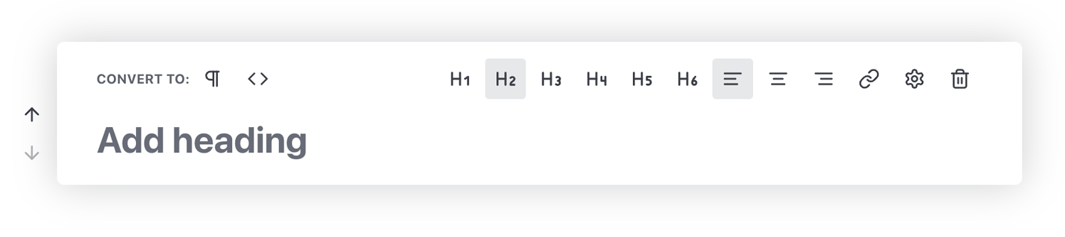
Header
The second option, Header, inserts a header block which is important for adding titles and subtitles to your text. This is useful not just for the aesthetics, but also as properly-used headers can be useful for SEO, improving your findability in search engines.
Clicking on the header option will, by default, insert an H2 header, since usually the H1 should be used only once in the post title. However, you may convert your block to any header from H1 to H6 using their respective icons that appear when opening the Formatting Toolbar.
Inserting Images
The third option in the Insert Bar allows you to insert an Image into the block. Clicking on this option will create an image block, where you may then drag and drop an image file into the grey area to insert the image, or click on the Select File button to open your computer's file explorer to choose a file.
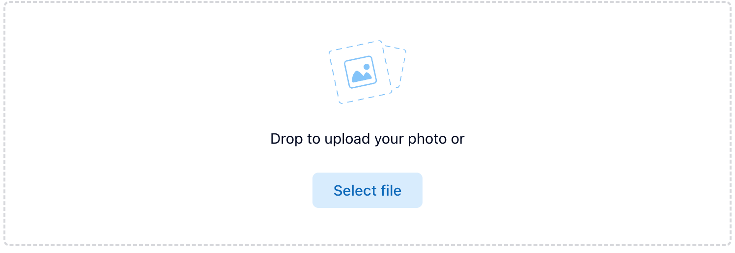
Once a picture has been chosen it will be added to the block; at this point, there are multiple additional options available for styling and adding captions and other elements to the image.
To add a caption and alt-text to your image, insert your text in the respective fields underneath the image. For styling your image, you can open the Formatting Toolbar.
Styling Your Image
There are also several styling options available via the Formatting Toolbar which let you decide exactly how you want the image to be displayed in your post.
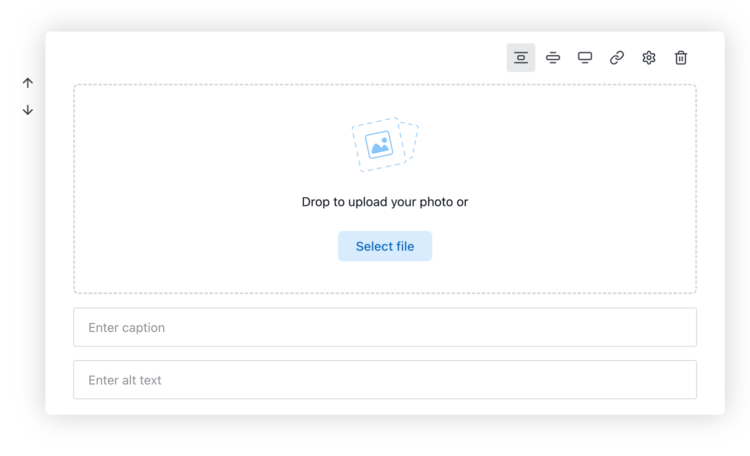
The first three icons in the Formatting Toolbar for the image block allow you to select the size of the image on the page; the first icon sets the image to be slightly smaller than the width of the text, the second icon sets the image to be slightly wider than the text, and the third icon sets the width to the full size of the page. The image will be dynamically-scaled to show each option as it is chosen, so feel free to test them all to see which one works for you!
Creating a Link in the Image
You may wish to add a link to the image, rather than leaving it as a purely static element.
The chain icon in the formatting toolbar allows for the image to include a link to a different part of your site, to an external site, or to a specific file. To insert a link, open the formatting toolbar and click on the chain insert link icon.
Adding CSS Classes and IDs to the Image
For users that want to have more complete control over how the image is displayed by targeting it specifically in CSS, you may add a CSS class or an ID to the image via the Settings icon, the fifth icon in the formatting toolbar for images.
Clicking on the Gear icon will open the settings pop-up. From here, you can add your CSS class or ID into their respective fields, then click the Save button to close the pop-up and apply your changes.
Deleting an Image
If you decide that you don't want to use the image in your post anymore, you may delete it by clicking on the last icon of the formatting toolbar, the Bin icon. To prevent accidental deletion you will need to click on this icon twice before the image will be deleted; on the first click you will see the bin icon change color to red, then a second click will confirm deletion.
You can also delete an image by hovering your cursor over the image, then clicking the Red Bin icon that appears in the top-left of the image twice to delete.
Inserting Galleries
The fourth option in the list of block types is the Gallery block. If you have a large number of pictures that you want to display, then a gallery offers a simple but elegant solution. An unlimited amount of pictures can be added to a gallery, which will be displayed in a column-style format that will adjust the position of the pictures automatically to fit the screen size effectively:
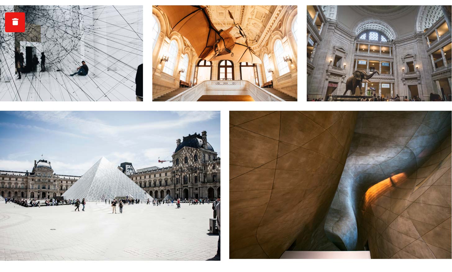
To create a Gallery, open the Insert Bar and click on the Gallery option. Just like when you are inserting a standard picture a grey section will appear where you can drag and drop your files, or click on the Select Files button to grab your images via the file manager.
Modifying the Gallery
By opening the Formatting Toolbar, you can access largely the same options as when you are inserting a single image, with icons for setting the width of the gallery. However, there will also be one additional option, Columns. Changing the number here will adjust the number of columns that the images are sorted into.
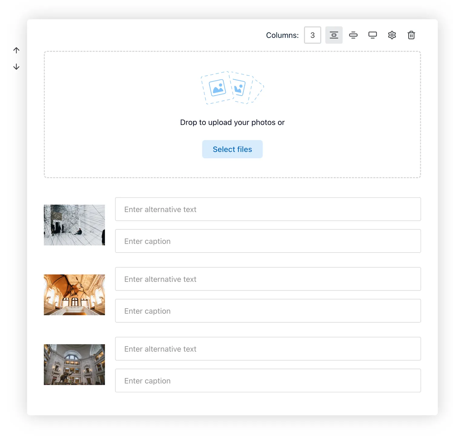
Otherwise, deleting and adding CSS and IDs to your images will function the same as detailed above in the Inserting Images section.
Lists
The fifth option in the list of block types allows you to insert a List block. A list can be unordered, which uses bulletpoints for each item, or ordered, which adds a number to each item, starting from one and ascending.
To insert a list block, open the Insert Bar and click on the List option. By default this will create an unordered list, but you can switch to an ordered list by Selecting the Block to open the Formatting Toolbar, then clicking the Ordered List icon at the top-right of the block; the icon looks like a list of numbers rather than bullet points.
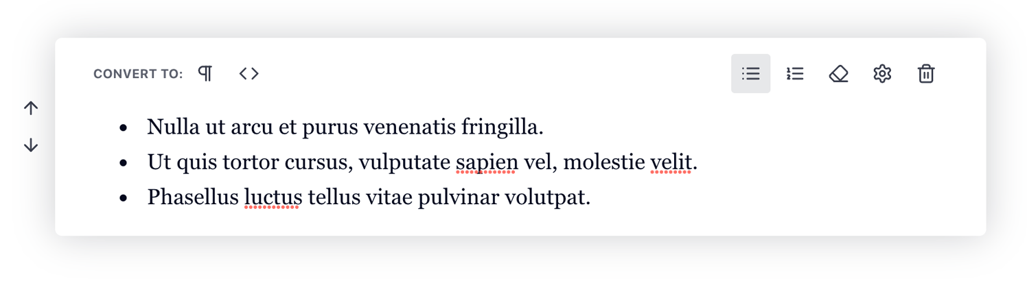
After creating a list, the first bulletpoint or number will be added, ready for your text. To add more items to the list, simply press enter when the cursor is active in the block; this will create a new item underneath the existing one. To delete a item, you can use the backspace key as normal; once you reach the beginning of the line it will remove the current bulletpoint or number.
Quote
The sixth option in the list of block types inserts a Quotation block. This block adds styling to highlight the text as a quote, and also adds an additional field where you can place the Quote Author. Note that the exact styling of the block will differ depending on the theme that you are using.
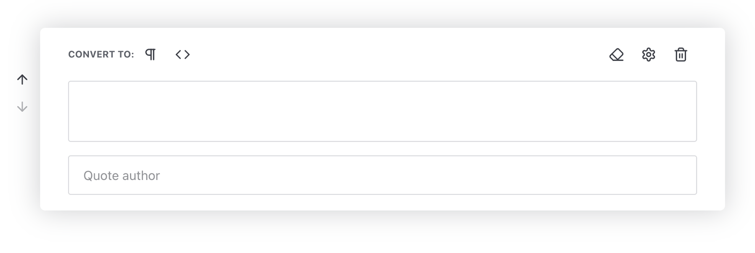
After clicking the quotation icon, you will see two fields; Quote Text and Quote Author. As you'd expect, the quote content itself should be added to the Quote Text field, and the attribution name in the Quote Author field.
The Quote Text field is required; until some text is entered the block will not be converted to content. However, the Quote Author field is optional, so you can safely add quotations direct from the article for visibility without attributing it to yourself!
Displaying Code
The seventh option in the list of block types converts your block into Code; this is useful for users that want to include code examples in their posts. Clicking on the icon will change the block to display a Code Editor:
Inserting content into this editor is the same as when you are adding normal text. However, pressing enter in the code editor will not create a new block, instead, it will create a new line in the code editor, with each line being numbered for easier reading.
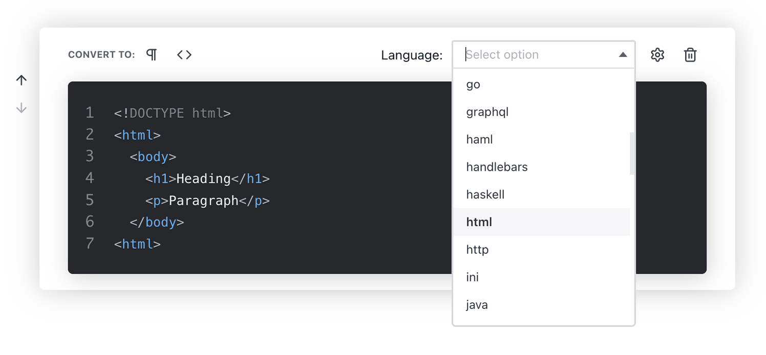
Setting the Code Language
By opening the Formatting Toolbar, you will be able to set which programming language is used in the code block; this will affect how the content is colored and formatted. After opening the formatting toolbar, the first option is Language. Click on this option to open a drop-down list that displays all the available languages, then click on the language you wish to use in the code block.
Converting a code block back into a regular Paragraph block will maintain the formatting of the text, but the styling will be reset to the standard for the theme.
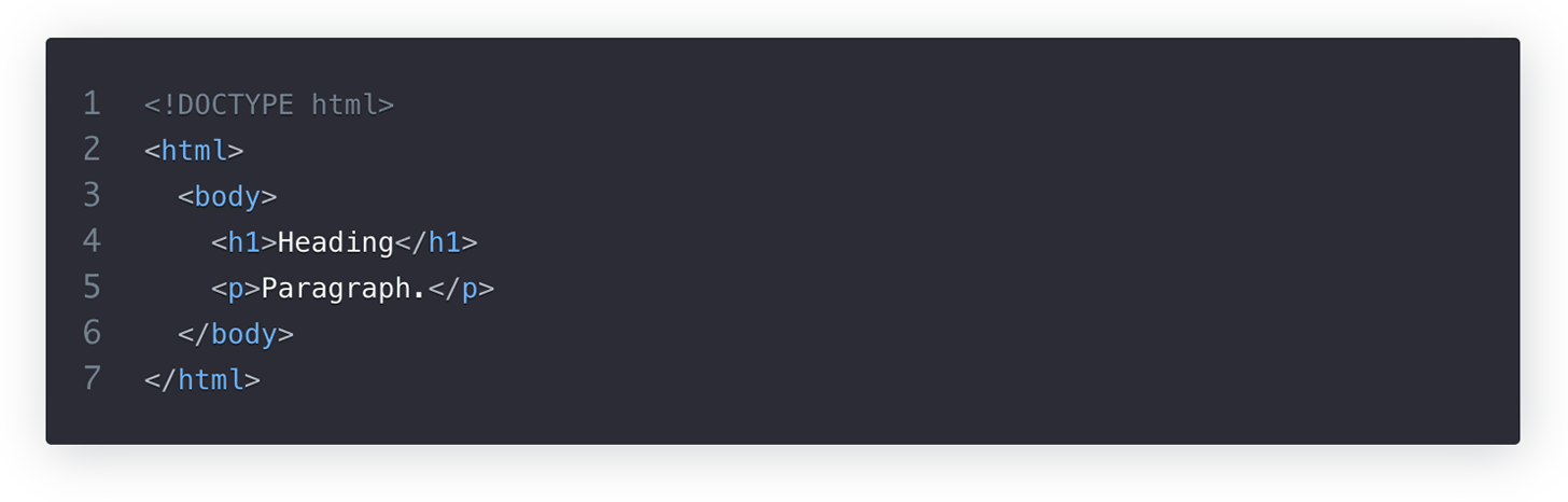
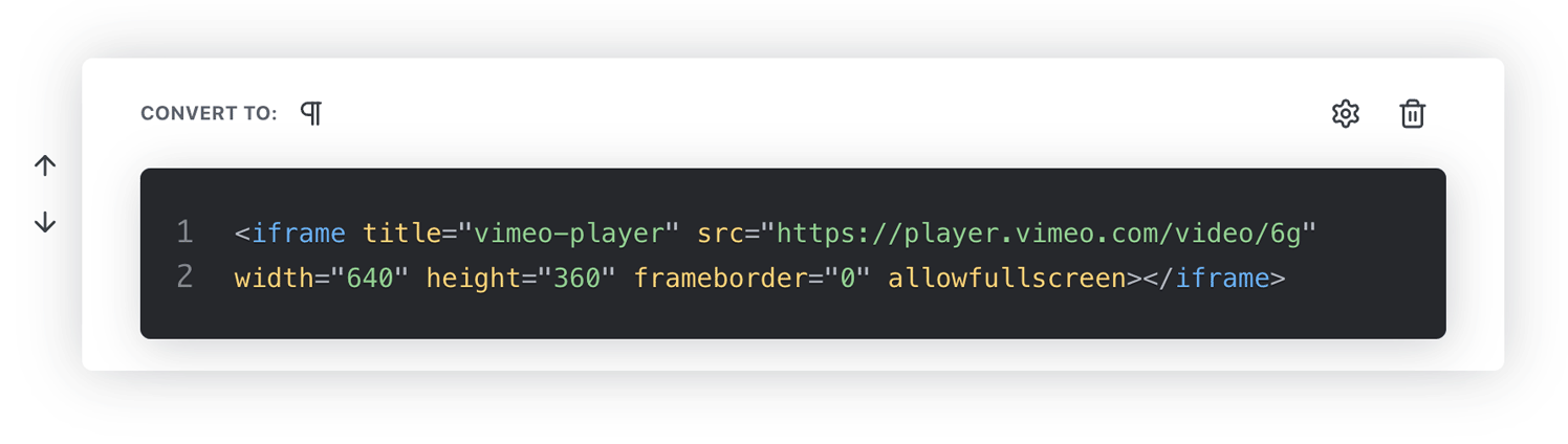
Using HTML
The seventh option in the list of block types is used for inserting HTML content. As discussed earlier in The Publii Editors section of this guide, your post content needs to be converted to HTML to be displayed in browsers correctly. By converting your block to HTML, you will be able to directly manipulate and insert your own HTML code; perfect if you need to use a specific tag or formatting that isn't directly usable in the Block Editor.
Inserting a Separator
The eighth option in the list of block types changes the block to contain only a divider, which can be used to separate paragraphs that are not directly connected thematically or to add an aesthetic touch to the page.
A divider will take up an entire block, and no additional text can be added.
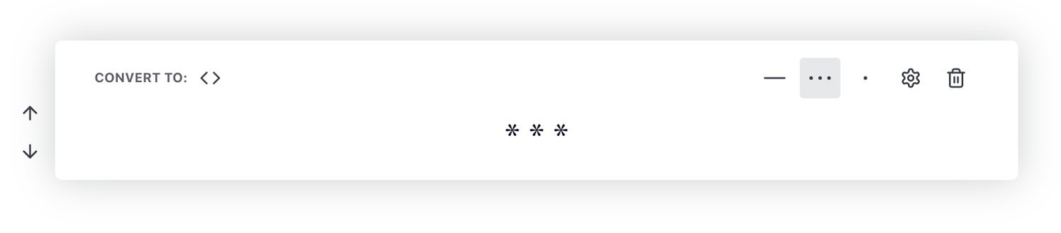
Inserting a Read More Button
The ninth option in the list of block types, which is labeled Read More, is used to insert a read more link into your content; if the article is displayed in a preview, such as on the homepage, it will usually display a set number of words as per the Excerpt Length option available in the Theme section of the Publii app (accessible via the left-menu) in the Basic Settings section. When a read-more section is added to your text, it will prevent any text after the read-more from being displayed in these previews; helpful if your article begins with a short paragraph and you don't wish to include part of the next paragraph in the preview.
To add a read-more to your article, simply open the Insert Bar and click the Read More option in the list of block types; the read-more will be automatically added and activated.
Note: Only one read-more can be added into an article; once one has been added, the option will no longer appear in the list of available block types in the Insert Bar. Should you wish to move the read-more, you can click the up and down arrows that appear to the left of the block when it is selected to move it up and down in the block order, or delete the block entirely, allowing you to insert a new read-more block.
Inserting a Table of Contents
The last option in the Insert Bar is for inserting a TOC (Table of Contents) to your post. A table of contents can be a useful tool to help users find a specific part of your post, especially long-form posts with many sections, or documentation where users will not necessarily need to read the entire post to get what they need.
Generating a table of contents is largely automated in Publii; after clicking on the corresponding icon, a Label field will be added to the block; here you can define the title for your table. The actual table will be generated automatically using the H1-H6 headers in your post, with indents to show subsections.
The Inline Editor
Since the block editor is still at its core a word processor, it includes the standard text formatting options that you would expect, including:
- Change text to Bold.
- Change text to Italic.
- Add Underline to text.
- Strikethrough text.
- Inserting links.
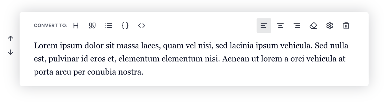
These basic functions are provided by an inline editor, which opens automatically whenever a block of text is highlighted, or if you double-click on a word in a block:

The first four icons in the toolbar cover the basic formatting settings; starting from the left; adding bold, italic, underlined or strikethrough text. To use these options, use your mouse to highlight the block of text you wish to change, which will automatically display the inline editor. Then, click the appropriate icon to modify the text accordingly.
The last icon on the right of the toolbar also provides a basic formatting function; highlighting text. This adds a coloured background to the text to make it stand out from other areas; useful for highlighting important phrases in your content. As before, to add a highlight, just select the block of text that you wish to highlight to bring up the inline editor, then click on the last icon on the right to apply the highlight.
The other two middle options, with a icons that look like a chain and curly braces, respectively, offer slightly different options that simple text formatting. The curly braces are for changing the text to resemble the Code styling as with the Insert Bar function detailed above; however, if differs slightly in that only the highlighted content will be converted to code, rather than the entire block. The chain icon is for inserting links; let's look at that now:
Inserting Links
The chain icon in the inline editor allows for your text to be converted to a link, so that users may click on it to be taken to a different part of your site, to an external site, or to a specific file. To insert a link, select the text that you want to convert to a link in your text, then click on the insert link icon in the inline editor. The Insert Link overlay will appear:
In the overlay, the tabs at the top allow you to choose what type of resource you want to link to, while the field in the centre allows you to select the resource. The available link types are:
- Custom - This option is for links that go to a URL that is most often external to your Publii site. If this option is selected, you should add the complete URL you wish to link to in the field in the centre of the overlay e.g. https://example.com. Also helpful for anchor links that take you to a specific place on the page.
- Post - This option creates a link to a specific post on your Publii site. After selecting this option, you can click on the drop-down list in the centre of the overlay to select a post. If you have a lot of posts, you can start typing to dynamically filter the list.
- Page - Similar to the Post option, this allows you to create a link to a specific static page on your Publii site. Select the target page from the drop-down list.
- Tag - This option links to a specific tag page on your Publii site, showing a list of posts attached to the tag. As with the post, you can select which tag page to link to in the drop-down list, or type to filter the results.
- Author - Just like the tag and post options, this option lets you link to an author page on your Publii site, showing a list of posts created by the specified author. Select which author you want to link to in the drop-down list.
- File - This option creates a link that allows users to view or download a file that is included in the website files of your site, for example a .pdf or other text document, a media file, or other content that is not readily displayable on a webpage. If this option is selected, clicking on the field in the centre of the overlay will let you choose a file from the Publii File Manager; as with the other options, you can type to filter the visible results.
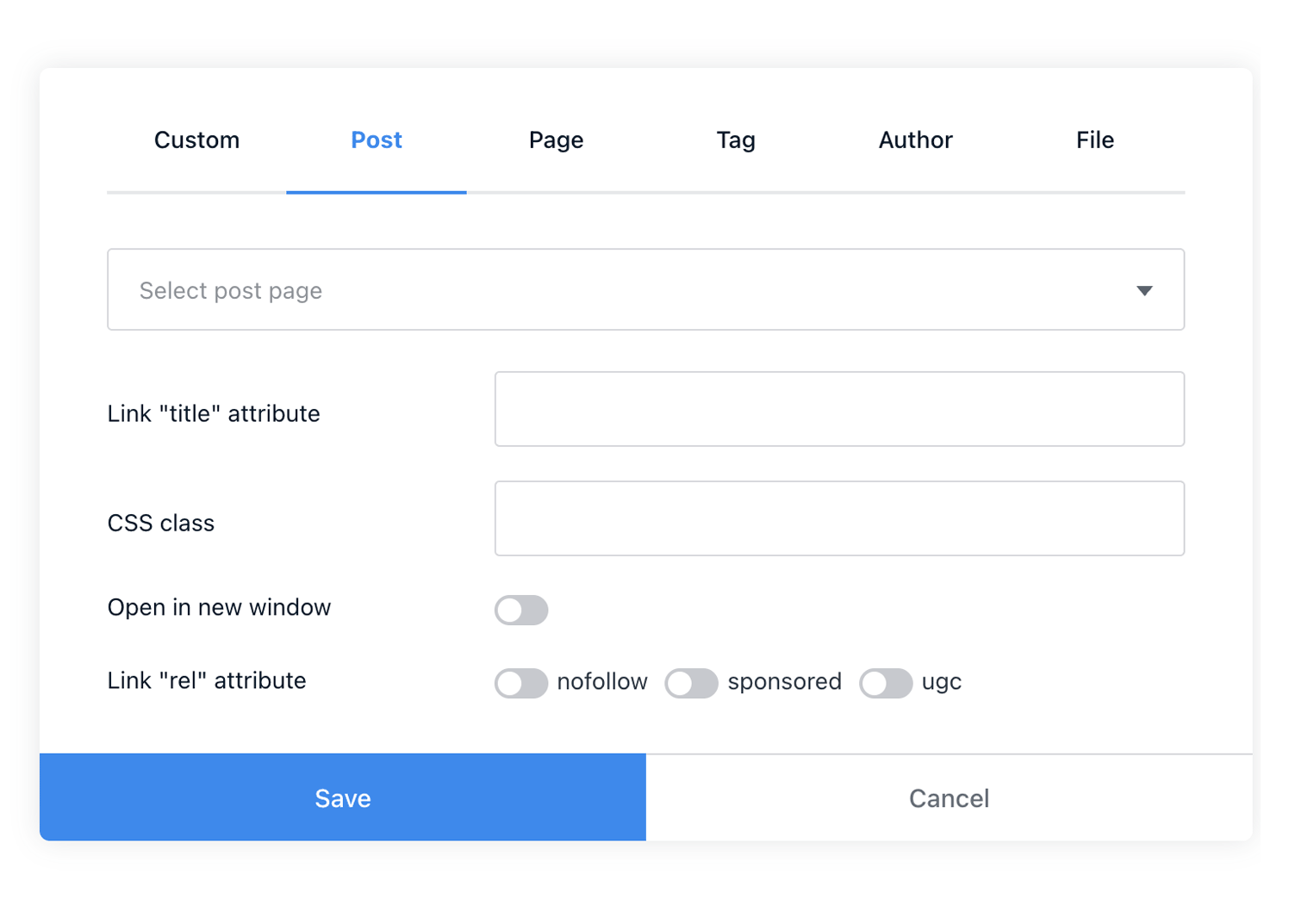
Once you have chosen a link type and set the target, you'll need to set the Attributes of the link. These are controlled via the fields and toggle buttons underneath the address field in the overlay, with the following options available:
- Link "title" attribute - In this field, you can add text that will appear as a tooltip when a user hovers their mouse over the link. This is useful for providing extra context about the link's destination.
- CSS class - This field allows you to add one or more custom CSS classes to the link element, which can then be used to apply unique styling to the link with your own CSS code.
- Open in new window - Enabling this attribute will force the browser to open the link in a new window or tab, rather than directing the currently-selected tab away from your site to the linked URL.
- Add "download" attribute - This attribute is only available when adding a File link, and forces users to download the file rather than viewing it in their browser.
- rel="nofollow" - This attribute tells search engines not to follow the link when indexing your site; it can be useful for SEO purposes.
- rel="sponsored" - This attribute marks the link as a 'sponsored' link i.e. it tells search engines that the link was paid for by an advertiser, or includes some kind of benefit for your site, so it should not be followed as part of your site content.
- rel="ugc" - This attribute marks the link as "user-generated content", suggesting that the link was not created by the site owner, but was instead posted by another user, such as in a comment or other user-generated content. This again is used by search engine robots to decide whether to follow the link when indexing your site.
If your link information is completed and your attributes set, then you can click on the Save option to finish creating the link.
Removing Links
To remove a link that you have created, double-click on the link in the post editor, or highlight the block of text to open the inline editor. You'll notice that there is a new icon available next to the insert link icon, displaying a broken chain. This is the remove link option, so click on that, and the text will be returned to normal.
The Conversion and Formatting Toolbars
As discussed earlier in this guide, clicking the Double Ellipses icon to the left of the selected block will display two additional toolbars for modifying your content on the fly, unlike the Insert Bar which may only be used when the block is empty. The Conversion Toolbar is located at the top-left of the block after opening the options, along with the text 'convert to', and the Formatting Toolbar will be on the top-right of the block, providing controls for formatting text and other block-specific functions.
Since some of the functions here are duplicated from the Insert Bar you may already be familiar with many of the functions in these toolbars, but for the sake of clarity we will cover each function in full.
Note: The Convert To and Text Formatting options are only available in text-based blocks, such as paragraph, list, quotations and code blocks. Unique blocks, such as images or galleries, will not include these options.
The available options in these toolbars, from left to right, are:
Conversion Toolbar
- Convert the block to a Header
- Convert the block to a Quotation
- Convert the block to a List
- Convert the block to Code
- Convert the block to HTML
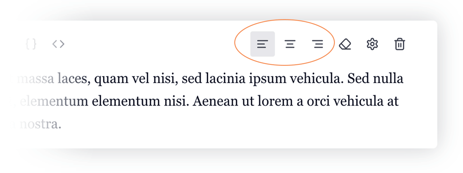
Formatting Toolbar
- Align Text to the left
- Align Text to the centre
- Align Text to the right
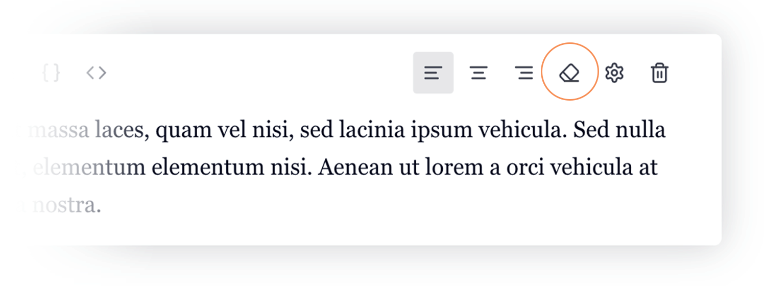
- Remove Formatting from the block
- Additional Settings
- Delete Block
Let's look more closely at formatting functions:
Aligning Text
If you are using the standard paragraph style for your block, the first three icons in this section are for aligning your text on the page. To align text to the left (default), centre or the right, click on the respective icon in the toolbar.
Removing Formatting
The next icon in the Formatting Toolbar, which looks like an eraser, will remove all applied text formatting in the block, such as bold, underline or strikethrough text. It will not change the block type e.g. if you've formatted your content as code, it will not convert it back to a standard paragraph. To change your block back to a standard paragraph, you can click the Paragraph icon that appears as the first icon in the Conversion Toolbar if the block is not set as a paragraph.
Advanced Settings
The fifth icon in the Formatting Toolbar, which looks like a gear, open the Advanced Settings pop-up. Here, you can apply theme-specific formatting to your text content, as well as add CSS Classes and IDs to your block.
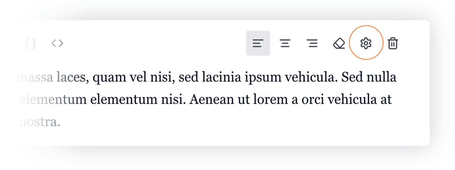
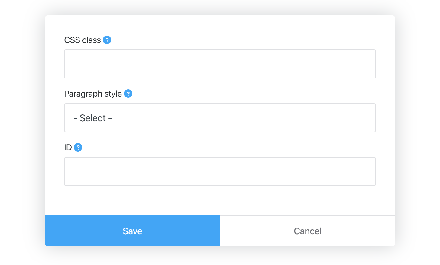
The settings available in this section include a CSS Class and ID field, where you can enter a specific class or ID to add your own styling to the block. The centre option in this section, Paragraph Style, allows you to modify the block with a selection of theme-specific typography options to indicate the type of content. Though these options can change depending on the theme, generally in Publii-native themes you will find the following options:
- Info - Styles the block to an info box.
- Highlight - Highlights the block to draw attention to the contents.
- Success - A lighter highlight to indicate beneficial content.
- Warning - Usually red-coloured to indicate a potential issue or things to be careful of.
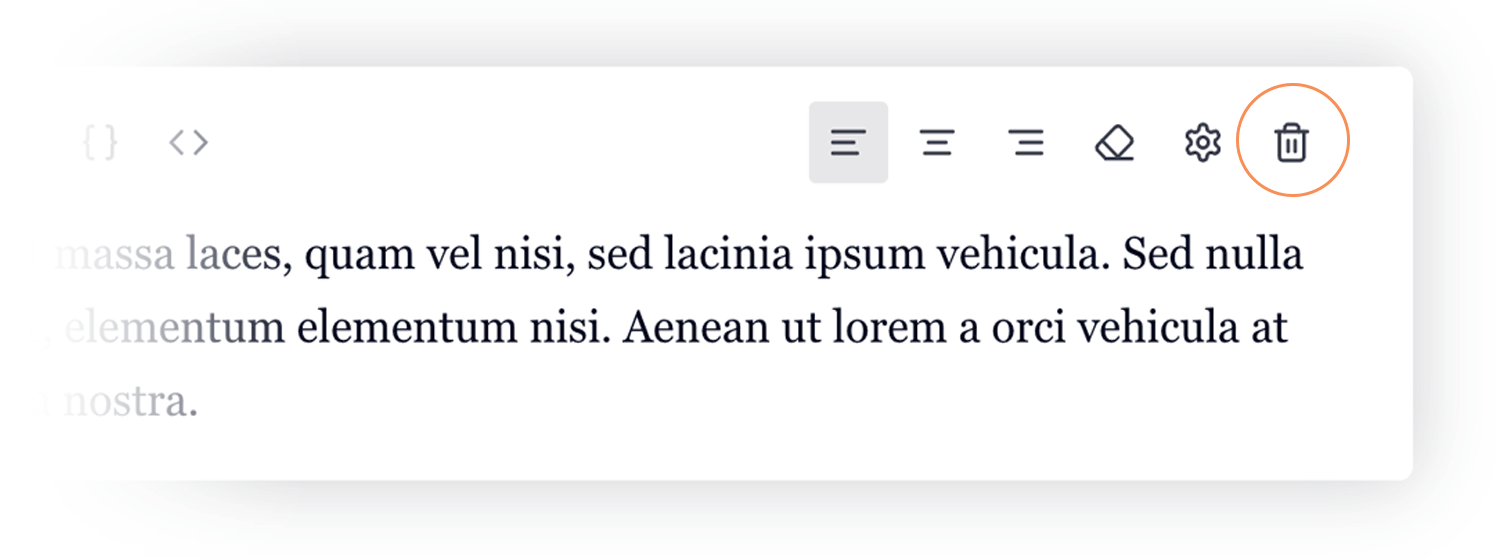
Delete Block
The last icon in the Formatting Toolbar, which looks like a bin, is for deleting the block entirely. To ensure that blocks are not deleted accidentally you will need to click on this icon twice to confirm deletion.
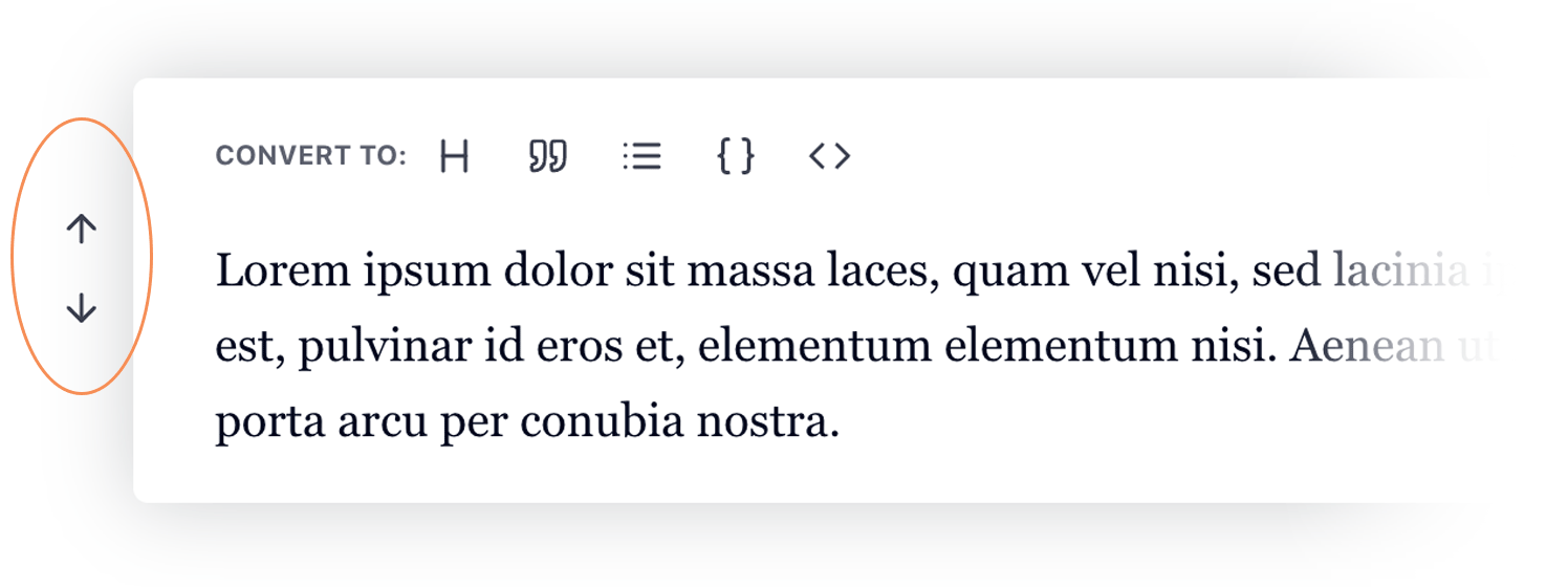
Moving Blocks
One of the benefits of the block editor is that it allows you to reorder the blocks, moving them up or down on the page to get your layout just right. To reorder blocks, first click on the Double Ellipses icon to open the toolbars. Then, click on the up and down arrows to the left of the block to move the block up or down in the hierarchy.
Bulk Editing Blocks
If you've added a lot of content to your post, then using the regular duplication, deleting and reordering options may be too slow and unwieldly. In such cases, you can take advantage of the Bulk Edit sidebar to quickly rearrange the order of the blocks on the post, or duplicate and delete existing posts in a much more efficient and user-friendly way.
To open the Bulk Edit Screen, click on the Bulk Edit option at the bottom-left of the block editor window; this will open the left-sidebar displaying a list of the blocks on your site, along with the bulk edit options:
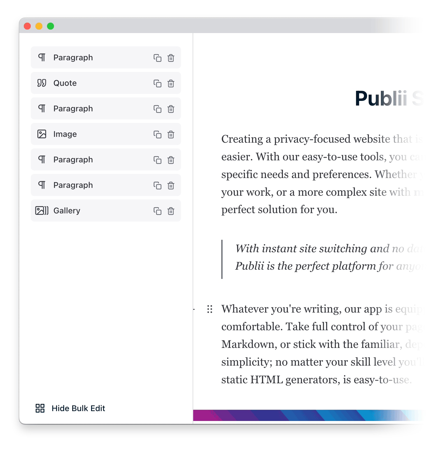
From here, you can perform three useful functions:
Reorder Blocks
To reorder the content blocks in your article, in the list of blocks in the left-sidebar, drag and drop the block you wish to move to its new position in the order; it will be inserted wherever you drop the block in the list, pushing all the following blocks one step down.
Duplicate a Block
To duplicate a block, click the double-square icon to the right of the block you wish to copy in the bulk editor; a copy of the block will be immediately created under the selected block, ready to be dragged and dropped to wherever you need it.
Deleting a Block
To delete a block via the bulk edit sidebar, click on the Trash icon to the right of the block that you wish to delete two times; on the first click the icon will change, and a second click confirms the deletion.