The WYSIWYG Editor
Like almost any other CMS, Publii includes a WYSIWYG (What You See Is What You Get) editor for content creation. This editor allows users to write text, insert pictures and other elements much like you would in a standard word processor like Microsoft Word, and converts it to browser-friendly HTML for you. As such, you'll find writing content to be easy even if you've never built a website before, but there are a few additional options available via the editor's toolbar, which we'll look at here.
The WYSIWYG Editor Toolbar
As with any standard word processor, the WYSIWYG editor includes options for common text formatting, as well as more website-specific functions. In this section we'll cover each of the options from the toolbar. If you are unsure of what a particular icon does, simply mouse over it to see a tooltip.
Basic Formatting
There are some options that no word processor should be without, and the first section of the toolbar covers these:
- Change text to Bold.
- Change text to Italic.
- Add an underline to text.
- Strikethrough text.
- Change the text colour.
- Align text left.
- Align text to centre.
- Align text right.
In this first section there are also some options for working with website content, such as inserting or removing links, inserting images and media, and creating a table of contents, as well as options that are common in word processors but have additional settings or work slightly differently, such as bullet and number lists. Information on these options may be found below.
Inserting and Removing Links
To insert a link, move the cursor to the area where you want to add the link, or highlight the text you want to change into a link, then click the Insert/Edit link icon in the toolbar. This will open a pop-up with the following options:
- Select link type - Choose whether to link to content on your Publii site, a file from the File Manager, or a custom URL.
- Custom link - Enter the URL you want the text to link to. This field appears when the Custom link type is selected. For other link types, choose the relevant post, page, tag, author or file from the list provided, where applicable.
- Link label - Enter the text that should be displayed as a link here; if you highlighted a block of text before clicking the icon, this will already be filled.
- Link "title" attribute - Text entered here can be displayed as a tooltip when the user hovers over the link.
- Link target - If set to Same window, the link will open in the same browser tab. If set to New window, the link will open in a new tab or window, depending on the browser's settings.
The pop-up also includes options for CSS classes and link attributes, described in the Advanced Link Insert section below. Click OK once the fields have been completed to insert the link. To remove a link, simply click on the linked text in the editor and then click on the Remove link icon in the toolbar.
Inserting Emojis
The Publii WYSIWYG editor includes an extensive selection of emojis that can be inserted into your content. To open the emoji picker, click the Emojis icon, which looks like a smiley face, in the toolbar. This will open a pop-up with the available emojis:
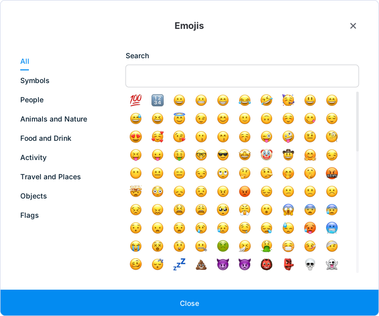
From here, you can select which emoji you would like to insert into your content. The categories on the left of the pop-up allow you to filter the emojis by subject, or you can use the search field at the top of the pop-up to search for a specific emoji. When you find the emoji you want, click on it to insert it into your post.
Inserting Blockquotes
Blockquotes are a way to draw attention to quotations in your post. To insert a blockquote, click the Blockquote icon in the toolbar. The appearance of the quotation, including its alignment, font size and any decorative quotation marks, depends on your theme. You may then continue entering text as normal; hitting Enter once will start another paragraph within the blockquote. Press Enter again without adding more text to end the blockquote.
Inserting Bullet and Number Lists
Publii includes the two basic list styles that can be found in text editors: bullet and number lists. They are essentially the same, but bullet lists display each item with a single bullet point, making them useful when inserting a list of things that are not ordered, while number lists use ascending numbers instead of bullet points, making them better for instructions that need to be followed in order.
To insert a list of either type, place your cursor where you want the list to be inserted, and click the bullet or number list icon. This will create the first item in the list. Enter the text for the item, then hit Enter once you are finished to automatically create the next item. Once all items are added, hit Enter on a blank item to remove the blank and end the list.
One additional feature in Publii's editor is the ability to choose a specific style of number or bullet; by clicking the arrow next to the bullet or number list icon, you can choose to stick with the default style, or alternatives such as Roman numerals, discs or squares.
Inserting Images
There are two ways to add images to your posts. The first, and easiest, is to simply drag and drop the image you wish to use onto the editor area; the image will be imported into your site and inserted into the content. However, this method only inserts the image with default settings. If you would like more control over the image's appearance, you can use the Insert/edit image button in the editor's toolbar.
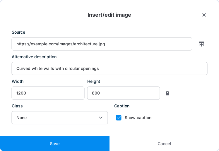
Clicking it will open the Insert/Edit Image pop-up, where you will see the following options:
- Source - Displays the path to the image that will be inserted into the post. Click on the icon to the right of the field to open the file browser, then select the image you wish to insert from your computer. Alternatively, if the image you wish to use is located online, you can enter the URL to the image in this field; remember to ensure you have the necessary permission to post an image if you do not own the rights to it!
- Alternative description - Add a description of the image; this can be displayed should the image fail to load, or read by a screen reader to provide information about the picture.
- Width/Height - Sets the width and height of the picture in pixels; when an image is selected, its dimensions will be automatically populated in these fields, though you can change them to adjust its display size if needed.
- Constrain proportions (padlock icon) - When this option is enabled, the aspect ratio of the chosen image will be preserved when resizing, ensuring that the image doesn't appear stretched. Entering a width into the Width field will automatically populate the height field with the appropriate size.
- Class - This option allows you to modify the appearance of the image in the post. Choose from None, Full image, Wide image, Left-aligned image, Right-aligned image or Centered image. The resulting width and alignment depend on how your theme styles these classes.
- Show caption - When this option is enabled, a caption box will be added underneath the inserted image in the editor, where you can enter caption text for the picture.
Click Save to insert the image with your chosen settings.
Note: If you are encountering issues when creating or regenerating image thumbnails, try switching from the default Sharp image engine to the included Jimp engine. You can change the Image resize engine in App Settings, accessed through the three-dot menu.
Editing an Existing Image
If you've previously inserted an image into your post and wish to modify some of its settings, you may do so by first clicking on the image you wish to modify in the editor, then clicking the Insert/edit image button. This will reopen the pop-up containing the image options, which you can then modify accordingly. Click Save to apply the changes.
Inserting Galleries
You can create and edit image galleries directly in the WYSIWYG editor. To let visitors open gallery images in a lightbox, install and enable a gallery plugin for your site. The plugin provides the enlarged image view and its controls, while the editor lets you choose the images, captions and gallery layout. More about gallery plugins can be found in this guide.
Creating a Gallery
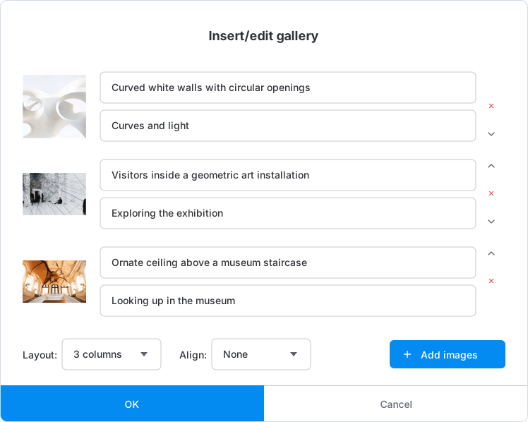
- To add a gallery to a post, place your cursor where you want the gallery to appear and click the Insert gallery icon, which displays multiple images. This opens the Insert/edit gallery pop-up.
- Click Add images to open a file browser and select the images to add to your gallery. You can also drag images from your computer into the gallery pop-up.
- Once an image is added, you may add alternative text and an image caption via the fields provided. To change the order, drag the image previews or use the arrows beside each image. Click the remove icon to take an image out of the gallery.
- To add more photos, click the Add images button at the bottom-right of the edit window.
- Once all your images have been added, select the number of columns, from one to eight, using the Layout drop-down. Use Align to choose None, Wide or Full width, then click OK to insert the gallery.
Editing a Gallery
To edit a gallery, open the post containing the gallery you wish to edit, then click on it in the WYSIWYG editor. This will reopen the Insert/edit gallery pop-up so you can add or remove photos, edit the alternative text or captions, change the number of columns, and adjust the alignment. Click OK to apply your changes.
Customizing Your Gallery
You can customize the style of your galleries to help them fit with your site aesthetic, and set which controls users will be able to access. Lightbox options are configured in the gallery plugin. Open Plugins in the left sidebar for your current site, enable the gallery plugin you want to use, and click its name to open its settings.
The available options depend on the plugin you choose. For example, Core Lightbox Gallery includes the following appearance settings:
- Slide spacing - Sets the gap between slides in the lightbox as a proportion of the viewport width. This does not change the spacing between thumbnails in the post.
- Overlay color - Sets the colour of the background shown around a photo when you open it in the lightbox.
- Overlay opacity - Sets the opacity of this background; a setting of 0 is fully transparent, while 1 is fully opaque.
It also includes options for controlling navigation and the buttons available in the lightbox:
- Show counter - Displays the total number of images in the gallery and the number of the currently viewed photo.
- Show zoom button - Controls whether a separate button for zooming is added to the lightbox.
- Show download button - Displays a button for downloading the current image.
- Show close button - Displays a button to close the lightbox when viewing a photo.
- Show previous/next navigation - Enables buttons for moving between photos in a gallery.
- Show caption - Displays the caption entered for each image.
- Enable keyboard navigation - Allows visitors to use the left and right arrow keys to navigate between images.
Click Save settings after making your changes. These settings apply to the galleries handled by the plugin across your site; the images, column count and alignment of each gallery are still set in the editor.
Inserting Video
Online video provided via YouTube, Vimeo and Dailymotion is a popular way to provide and consume content, so Publii includes support for embedding these videos in your posts. To insert a video, just like when inserting an image, place your cursor in the editor where you want the video to be inserted, then click the Insert/edit media icon in the editor toolbar. This will open the Insert/Edit Media pop-up with the following options:
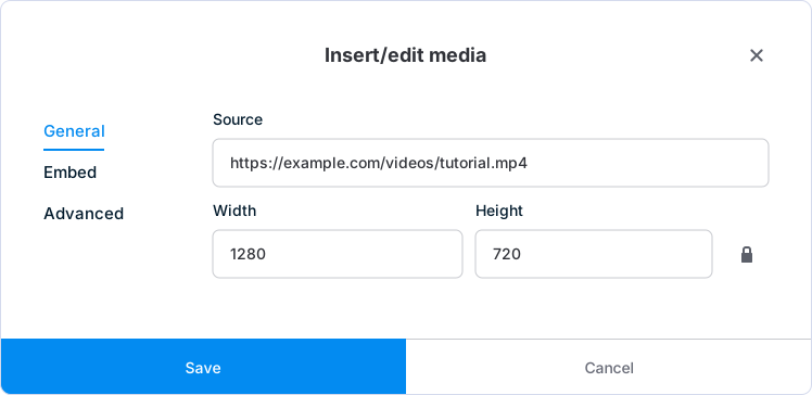
- Source - The source URL of the video you wish to embed; copy the full URL from a supported service and add it to this field. The embed code needed will be automatically generated. Alternatively, you can copy the provided embed code from the video's page and insert the full code into the Embed tab.
- Width/Height - Set the width and height of the video as you want it to appear in the post, in pixels.
- Constrain proportions (padlock icon) - As when inserting images, enabling this option will preserve the video's aspect ratio when you change its dimensions. Entering a width into the Width field will adjust the height to match the current aspect ratio.
The pop-up contains three tabs: General, the default section; Embed, for adding embed code instead of specifying a source URL; and Advanced. The advanced options provide two additional settings for videos embedded with the HTML video element:
- Alternative source URL - Enter another version of the video, such as a file in a different format, which the browser can use if it cannot play the first source.
- Media poster (Image URL) - Set the image displayed before the video plays. You may enter an image URL or use the file picker to select an image from your computer.
These advanced settings do not control the thumbnail or video sources of an embedded YouTube, Vimeo or Dailymotion player. Click Save to insert the media.
Editing a Video's Settings
If you've already inserted a video and wish to change its settings later, click on the video in the editor, then click the Insert/edit media button to reopen the settings for the selected video. Make your required changes and click Save.
Inserting Tables
Tables in the WYSIWYG editor work much like they do in other text editors. They are useful for displaying data such as pricing or survey results.
To insert a table, place your cursor in the editor where you would like to add a table, then click the Table icon in the toolbar, which will open the additional table options. Before your table can be inserted into your content you'll need to define its size; you can do this by highlighting the Table option, which will display a grid. By highlighting a cell in the grid with your cursor, you can set the total number of rows and columns; click on the cell to set the size and insert the table.
From here you can click on the individual cells to insert content. You may also click on the Table icon again to set additional options, like cell padding and spacing, borders and colours, as well as perform basic tasks such as inserting additional rows or columns and merging cells.
Creating a Table of Contents with Anchor Links
The Post Editor includes an option to auto-generate a table of contents for your post, which can be useful for longer content. To insert a table of contents, click on the section of your post where you want the table to be added, then click the Table of contents icon in the editor toolbar. Add headings to your post first, as the editor uses these to build the list.

The inserted table will be auto-generated from your headings, with nested headings grouped into subsections. For example, an H3 heading will appear beneath the preceding H2 heading, and any H4 headings beneath it will form another level. The appearance of the list, including any numbering, depends on your theme.
Each item in the table of contents will also have an anchor link assigned to it, so users can click on an item in the list to instantly jump to that section in the post.
Changing the Table of Contents Title
By default, the table will have 'Table of Contents' as its title. This can be changed by clicking on the title of the table in the editor; you can then delete or modify the title as needed.
Updating the Table of Contents
If more sections and headings have been added to the post after the table of contents was generated, you can update it by clicking on the table in the editor, then clicking the circular Update icon in the toolbar that appears. Updating the table also restores its default title, so apply any custom title after the update.
Styles
A theme in Publii can include additional formatting options for highlighting text, beyond basic bold or italic. These formats are accessible via the Styles menu in the bottom-left of the editor toolbar. Each theme can provide its own formats and styling; these may include highlighting blocks of text with a colourful background, inserting a drop-capital letter at the beginning of a sentence, or offsetting text.
To insert the desired format, place the editor cursor where you want the format to be used, then click Styles in the toolbar and select your desired format from the drop-down list. You can then type as normal, and the formatting will be applied.
You may also apply formatting to existing text by highlighting the text selection, then clicking Styles and choosing a format type as normal.
HTML Formats
The Blocks drop-down, next to Styles, allows you to change the HTML format of the text you are writing. It displays the current format, such as Paragraph, and includes Headings, Paragraph, Address, Pre, Code and Blockquote. As with the other formatting options, you can select the format before typing the text, or select existing text and change its format. More information on the basics of HTML can be found in the Posts section of this guide.
Inserting Code Samples
To display a block of code in your post, click Insert/edit code sample in the toolbar. In the Insert/Edit Code Sample pop-up, select the appropriate Language, paste or type your code in Code view, then click Save. Choose Plain text if you do not want a specific programming language. To edit an existing sample, click inside it and open the same tool again.
To add syntax highlighting to these samples on your published website, install and enable the Syntax Highlighter plugin for your site. The code sample tool inserts the code block; the plugin provides highlighting and options such as line numbers and a copy button on the website.
Find and Replace
When you need to make a lot of changes in one go, using the find and replace function can save time. To access it, press Ctrl+F or Command+F on your keyboard, or click the Find and replace icon in the toolbar. This will open the Find and Replace pop-up, where you have access to the following options:
- Find - Enter the text you want to find in your content here.
- Replace with - Enter the text you want to replace the found text with here.
Clicking the gear icon in the pop-up will also show three additional options:
- Match case - If this option is enabled, the search will only look for text that exactly matches the case entered in the Find field; useful if you need to change multiple lower-case words to upper-case or vice versa.
- Find whole words only - If this option is enabled, the search will ignore matching text that is part of a larger word. For example, searching for 'up' with this option enabled will ignore longer words such as 'upset'.
- Find in selection - Limits the search to text you selected before opening the dialog.
Once the options have been set, click Find to search; matches will be highlighted in your text. You may then choose to Replace the current match, or Replace all to change all matches. To move between matches, use the previous and next arrows beside the Find field.
Horizontal Line
Clicking the Horizontal line icon will insert a separator at the cursor position, indicating the end of a section. The style of the line will change depending on the theme you are using, but the functionality is always the same.
Read More
A read-more marker lets you choose where the preview text for a post should end. Place your cursor at the end of the introduction you want to use, then click Read more in the toolbar. Publii uses the content before this marker as the post's custom excerpt, which your theme can display on the homepage and other post listings. Visitors can then open the individual post page to read the rest.
Note: Most Publii themes have settings to control the length of automatically generated excerpts, so read-more markers are not always necessary. Use one when you want to choose exactly which introductory content is used for a particular post. The way that excerpt appears depends on your theme.
Clear Formatting
Clicking Clear formatting removes text formatting such as bold, italics and text colour from the selection. This may be used if you have accidentally formatted a whole passage, or want to restyle it from scratch. It does not remove every structural element; for example, use the block-format or list controls to change headings or lists.
Undo/Redo Changes
Everyone makes mistakes, or is caught out by unexpected editor behaviour that makes a mess of their formatting. In such cases you can click the Undo button, represented by a back-arrow, to revert the most recent change. If you undo something but then decide that you liked the change, you can hit the Redo button to reapply it.
Post Autosaves
Publii includes an autosave feature to help recover text after an unexpected closure or a change of mind after closing a post. Every 10 seconds, the editor checks for changed content and stores a local recovery draft. This works when editing both new and existing posts. The draft is kept for 30 minutes after the last autosave, allowing you to restore recent changes.
To restore a draft, reopen the same post in the editor and click Restore last draft in the toolbar; it has an icon that looks like a rewinding clock. Once done, the drafted content will appear in the editor, ready to edit. Autosave covers the editor content, rather than the post title and other settings, so continue to save your post normally.

Source Code Editor
If you're comfortable with using HTML, or you'd like to do some more advanced edits such as adding CSS classes to your post content, you can do so by switching to the Source Code Editor. Click the HTML code icon in the editor toolbar to switch to the source code. The WYSIWYG formatting tools are not available when working with source code, but you can search for specific content using Ctrl+F or Command+F.
One additional option available in the source code editor is Beautify code; when clicked, the source code of your post will be formatted to make it easier to read and modify. Click Apply changes to return to the visual editor with your changes, or Cancel to discard edits made in this window.
Alternatively, you may set the editor to beautify the code automatically when opened. Return to the main app screen, open the three-dot menu at the top-right of the app, then click App Settings.
From here, scroll down to Experimental features, enable Auto-beautify source code in the WYSIWYG editor, and click Save settings. Once done, the source code editor will beautify the code when opened.
Inline Editor
For ease of formatting your text content, the Post Editor includes an inline text editor; highlight a piece of text in the editor and a small version of the main toolbar containing commonly used options, such as bolding or underlining text and inserting links, will appear.

Advanced Link Insert
The inline editor opens the same link tool as the main toolbar, including its additional options for controlling link behaviour. Access it by highlighting the text you want to change into a link, then clicking the chain icon in the inline toolbar. Alongside the link label, target and title described earlier, the pop-up provides the following options:
- Select link type - Choose Custom link, Post link, Page link, Tag link, Tags list link, Author link, Homepage link, Post index link or File from File Manager.
- Post name, Page name, Tag name or Author name - The relevant field appears when you select one of these link types. Choose an item from the list, or type to filter the results. The post and page lists contain published items.
- Custom link - Sets the URL when the Custom link type is selected.
- File - Choose a file already added to the site's File Manager. This field appears when File from File Manager is selected.
- CSS class - Adds a CSS class to the link, which you can use with styling provided by your theme or custom CSS.
- Link "rel" attribute - Lets you add the nofollow, sponsored and ugc values to the link.
- Link "download" attribute - Available for File Manager links. Enable it to ask the browser to download the linked file.
To create an anchor link to a section on the same page, select Custom link and enter a hash followed by the section's HTML ID, such as #installation. The target must already have that ID; you can check or add it in the Source Code Editor. The link pop-up does not provide a separate list of heading anchors.
Markdown Shortcuts
The WYSIWYG editor in Publii supports several common Markdown shortcuts, which can help you create your post content faster. These convert typed markers into formatting within the visual editor.
| ## | Two hashes at the start of a paragraph, followed by Space, create an H2, or Heading 2, HTML element. |
| ### | Three hashes followed by Space create an H3, or Heading 3, HTML element. |
| #### | Four hashes followed by Space create an H4, or Heading 4, element. |
| ##### | Five hashes followed by Space create an H5, or Heading 5, element. |
| ###### | Six hashes followed by Space create an H6, or Heading 6, element. |
| 1. | The number '1' and a full stop at the start of a paragraph, followed by two presses of Space, create an OL, or ordered list, in Publii 0.48.0. |
| -, * | A star or hyphen at the start of a paragraph, followed by two presses of Space, creates a UL, or unordered list, in Publii 0.48.0. |
| *text* | A star before and after a piece of text turns it italic when you press Space after the closing star. |
| **text** | Two stars before and after a piece of text turn it bold when you press Space after the closing stars. |
Inserting Headings with Markdown
The heading elements in HTML (H1-H6) are used to create titles for your content. Each heading level shows where a particular title is in the post hierarchy; for example, the main title of a page or article usually uses H1, while each subsection of the article uses H2. If each section has its own subsections, they will usually use the next heading down: a subsection under an H2 heading will use H3, and so on. This creates a structure that is understandable to both people and computers. In Publii, the main title is entered in the Title field, and the other headings may be added manually as you create your content.
To insert a heading using Markdown, start a new paragraph and type the number of hashes corresponding to the heading you want. For a Heading 2 element, type ## and press Space. The editor changes the paragraph into a heading, ready for you to type its title. The shortcut is represented as:
## My heading 2 titleFor a Heading 3 element, type three hashes and press Space, and so on up to Heading 6. Press Enter after writing the heading to continue with a new paragraph.
Inserting Lists with Markdown
There are two types of lists common in HTML and in writing in general: ordered lists, with numbered items, and unordered lists, which use bullet points instead of numbers. For an unordered list in Publii 0.48.0, start a new paragraph, type a star (*) or a hyphen (-), and press Space twice before typing the first item's text. The second press converts the marker into a list item.
* The first item in my unordered list.After entering the first item, press Enter to create a second bullet point for your new line of text. Simply add your next item, then hit Enter again to create a third item, and so on. Once you've added all the items you want, pressing Enter on a blank item will end the list.
Inserting ordered lists works in the same way, but instead of a star or hyphen, type 1. and press Space twice. Once you've added enough items, hit Enter on a blank item to end the list.
Adding Bold or Italic Text with Markdown
Markdown shortcuts can change your text to bold or italic by wrapping it in the appropriate symbol: a star (*) for italics, and two stars (**) for bold. To make a sentence bold, add two stars before and after the text. For italic, add one star before and after the text:
**This text will be bold**
*This text will be italic*
This text will be unchanged.
The Post Editor will change the text as soon as you press Space after adding the closing star or stars, so you'll know immediately that it has worked.