Optimise fonts for a faster website
 Tomasz Dziuda
At a time when design is moving towards minimalism, focusing on greater simplicity and legibility, typeface can become one of the most distinguishing features of website pages. That's why graphic designers are often eager to use non-standard typefaces; it helps to distinguish the site and give it character without overcrowding the site aesthetics. And as more complex or more numerous fonts are used, it becomes important to ensure that they are optimised to avoid any negative impact on site loading and function.
The number of fonts matters
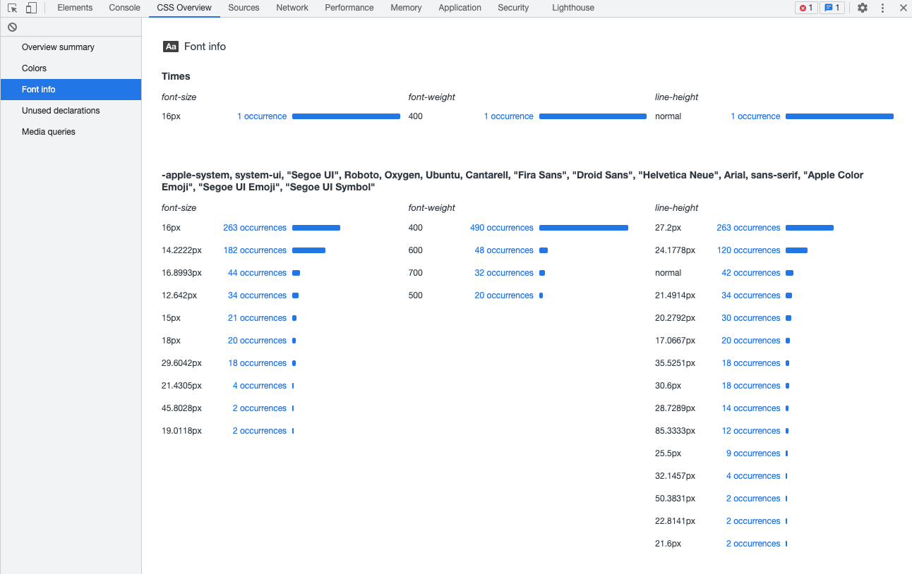
First things first; make sure to check that the number of typefaces used is not too large. A basic font won't have much of an impact, but as more are added, or more functional fonts are implemented, the impact they can have on load speed can become more apparent. To check how many fonts are being loaded on your site, you may use the CSS Overview tab in Chrome's developer tools; you'll first need to enable the CSS Overview option in the Experiments section of the developer tool settings:
As a rule of thumb, a site design shouldn't contain more than 3-4 typefaces; if your site has more than that it's worth taking the time to consider whether they are necessary, and if you can optimise simply by removing unnecessary fonts.
Load fonts locally
Since the Cache Partitioning system was implemented (https://developers.google.com/web/updates/2020/10/http-cache-partitioning) in popular browsers, using CDNs to load fonts makes much less sense than it used to. Before these changes were made there was a good chance that the user already had the most popular typefaces in his cache, which significantly reduced their loading time. With cache partitioning, this chance is severely reduced as the requirements required to ensure a 'cache hit' have been tightened.
Therefore, instead of using external services, it is better to load the fonts we use from the same server as the rest of the site files - thanks to this, we can avoid situations where unavailability or slowdown of the service that provides us with the fonts will affect the smooth loading of our website.
Use modern font formats
WOFF2 format, or even its older equivalent, WOFF, generate much smaller output files than TTF or OTF or EOT formats. Therefore, it is best to use these formats whenever possible; every small gain will give a small boost to your load times. Here, you can find an interesting article comparing size differences between the TTF and WOFF2 file formats for Google Fonts - even comparing TTF files that have been compressed with GZIP there can still be huge disparities in file sizes; WOFF2 can be between a reasonable 12% to a staggering 61% smaller.
Both WOFF and WOFF2 formats are still very well supported - https://caniuse.com/?search=woff so there's really no reason to continue using other formats today (except in some very niche cases that have specific requirements).
Limit the number of loaded font variants
Browsers have an inbuilt ability to generate bold or italics - depending on the typeface, you may find that the visual differences between the browser-generated style and the font-specific variant are so insignificant that there isn't any real need to load the additional font files; you can stick with the browser-generated functionality instead.
Take care though; as a rule, browsers don't cope so well with generating italics for serif typefaces. If you're using a serif typeface on your site, it's probably a better idea to take the small load hit of loading the italic version of the typeface separately, as it will look much better than the browser-generated style.
Optimize the font in before you use it on your website
The fonts we download can often contain a huge amount of characters to cover a multitude of alphabet variants; if you're blogging only in English, then loading Cyrillic, Greek or Asian characters that you'll never use is just adding unnecessary weight to your font files and can be safely cut out.
Optimising fonts in this way isn't a difficult task at all; one very convenient tool that you can use for optimising your typefaces quickly is Transfonter which allows you to convert typefaces to your selected formats, getting rid of additional characters and elements that you won't be needing.
Only need a few specific character? Then subset your fonts
Optimising your fonts by removing unnecessary can be taken a step further when you're not looking to use all the standard alphanumeric characters from a given set; you can limit yourself only to a few select character subsets. For example, let's say that you want a typeface to add some nice numbering to your lists; in this case, there's no need to load anything except the numeric characters. This operation can be performed using both the Google Fonts API (via the text parameter - https://developers.google.com/fonts/docs/getting_started) and the aforementioned Transfonter.
More decorations - larger sizes
Style is good, but sometimes we need to be thinking about optimisation first, even before we've chosen a font. As a general rule, the more elegant and decorative a typeface is, the larger the resulting file size. This is because the decorative elements require additional bytes to be written to the output file. We have to ask ourselves if the decorative font is absolutely necessary for our site aesthetic, or if our users would prefer the loadtime reduction that comes with smaller file size.
This interesting list of the smallest typefaces in Google Fonts: http://www.oxfordshireweb.com/smallest-file-size-google-web-fonts/ clearly shows that sans serif fonts have an advantage in lightness compared to serif typefaces. If speed is the priority, then try to keep it simple.
font-display: swap
This tip isn't about optimising load times, but it's still important as it will help prevent load stalls caused by a font file not being available. Research shows that users expect a site to load quickly, and even a small delay in displaying the page content can make them jump back to their search listings, so it's a good idea to make sure that you have a bit of redundancy to keep your page-loads smooth. By adding the following entry to your CSS code for @ font-face rules:
font-display: swap;...You can force the user's browser to, upon discovering that a font file is unavailable, load the text using an alternative typeface (typically the system typeface). Once the correct font is available and downloaded, it will be automatically applied to the displayed text.
This option is especially important for the user experience of people stuck with slow Internet connections - sometimes waiting for the typefaces to load may make it impossible to read the content of the page.
Of course, swap is not the only available value for the font-display property - learn more here.
Preload fonts
To further prioritize font loading, consider adding preload rules to the section of your website e.g.:
Such a notation will cause a given typeface to be a priority when loading, which will shorten the time between loading the first bit of page data and correctly-formatted text being displayed.
Embed fonts into CSS code
If your CSS code is not too extensive and you want to use a small and simple typeface, it's worth thinking about embedding the typeface in the CSS code itself rather than linking to a separate file containing the typeface. We can do this using the base64 format:
src: url (date: application / x-font-woff2; charset = utf-8; base64, ) format ('woff2');Be careful though; typefaces in base64 format will take up more space than if you were to separate the typeface into its own file, so you should analyse and test to see if this method of font embedding will bring benefits. In my opinion, the benefits will only be apparent when the font file itself is small - then the speed boost gained from removing the additional server query for the font file may offset the overall file size increase. This approach can be worthwhile if you're using a basic typeface with a very limited character set (then the font file itself will be small).
Not a fan of typography? Apply system fonts instead
We don't always need our content to be as stylish as possible; if legibility and simplicity are your goal then using a system typeface can be more than sufficient. Once applied, our website will adapt its typeface to match the style of the user's operating system; sure, you won't have fine-control over exactly what the user sees, but we can at least be sure that the content will be readable and the we save ourselves some load-time. The system font stack is described on CSS Tricks.
Variable fonts
Recently, variable fonts have been growing in popularity - these are typefaces that have additional parameters (variables) that can be modified via CSS code.
Live examples of changes to such parameters can be viewed on V-Fonts.com site.
With this approach, rather than loading a dozen or so files, we can load one file for the typeface, and use another file to hand different text thicknesses (assuming the chosen typeface supports this option). Interestingly, this method does not limit us to using standard thickness types i.e. 100, 300, 500, 600 etc...but allows very fine control. So we could, for example, specify a thickness of 256 or another numerical value that will suit our content perfectly. This provides a much wider range of possibilities for graphic designers and also allows us to correct some inaccuracies in the rendering of typefaces on different operating systems (anyone who has compared pages between Mac OS and Windows knows what I'm talking about!).
Due to the extensive support: https://caniuse.com/?search=variable%20fonts, this is an option that really merits some consideration.
Since the possibilities of variable fonts are much greater than just specifying the thickness of the text - I encourage you to read more about it to discover the possibilities it opens up: (https://web.dev/variable-fonts/).
Check for external services
You'd be surprised how often add-on typefaces or, in worse-case scenarios, icon fonts from which only one or two icons are in use, will load external plugins that can have a major impact on site weight and load-speed. It pays to take the time to check what is actually being loaded on your site as, regardless of your code, there may be a lot of additional typefaces and resources being loaded. If you can't find a way around this and performance is important to you, then put some time aside to look for alternatives to these plugins and services.
Let's summarize
At first glance, page fonts seem like a fairly simple area with little room for optimisation; just choose your font and go. However, as shown above, this topic is complex and has plenty of room for optimisation. In my opinion, the most important thing is to use common sense about the number of typefaces used on one page - this is where the most optimizations will most likely take place. Try not to be over-zealous when selecting fonts, and take the time to really consider whether those extra fonts are truly necessary.